An Introduction To Designing A Productive Website
05 Jan 2022
We live in a world where you get offers to complete your websites in one day or one hour even. Have you ever assessed the return from your one-day website? Or ever tried to explore the possibilities of how much a website can contribute to your business. Do you know that digital marketing share of the total marketing expenditure has touched 30% and growing. This indicates the importance of creating a usable website for potential users. Something that understands the user behavior and responds to their needs.
We will discuss about the things we need to consider making a website with a purpose.

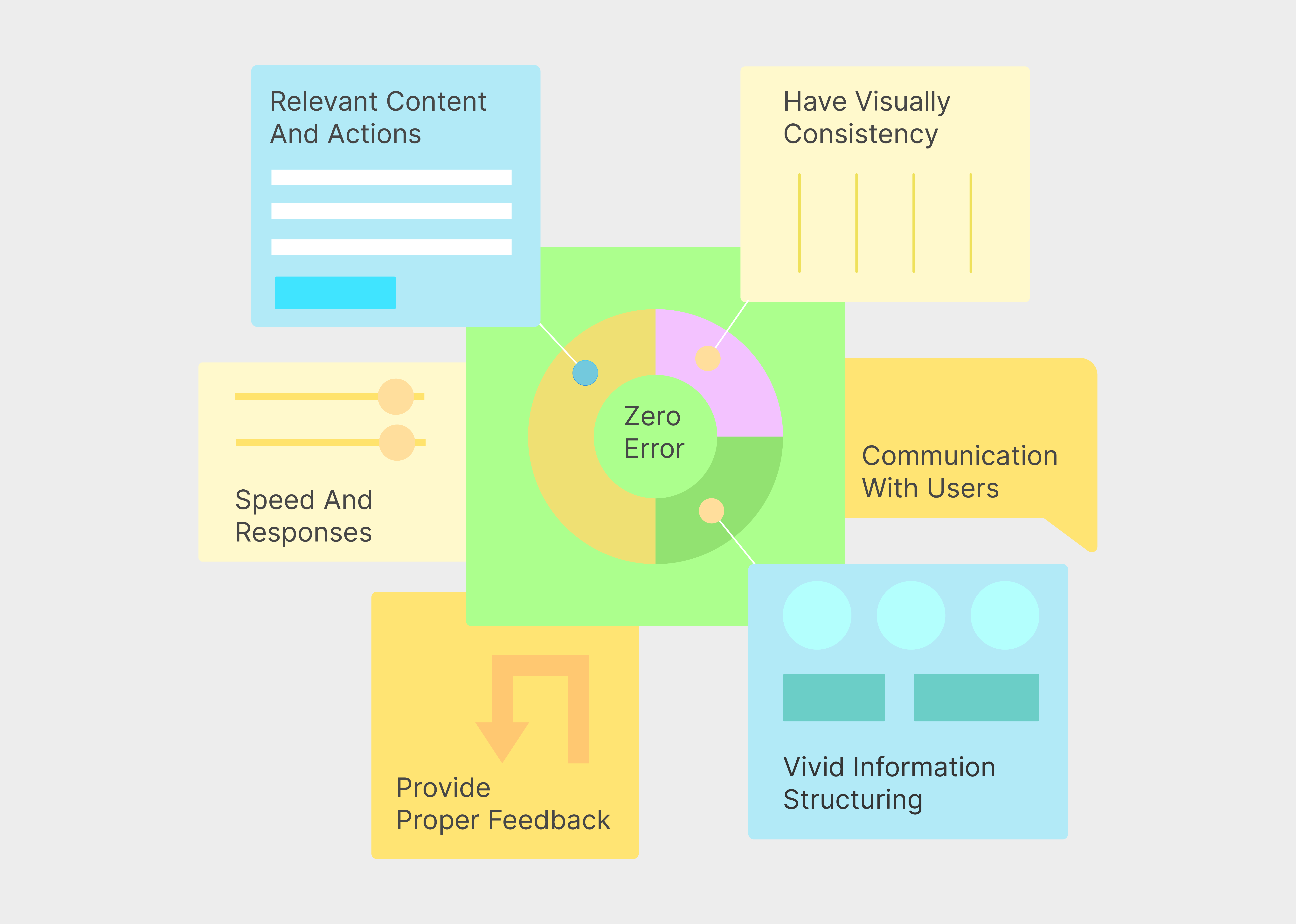
Communication With Users
Communicate the purpose of the website with the users. Ideally, your visitor should immediately understand what the website is all about and what problems they can solve here. Use simple language, illustrations or animations, but make sure it loads fast and communicates first. Remember, the patience level and attention span of human beings are coming down rapidly.
Self-Explained Navigation
If your users feel like they need to search and figure-out what want to know from your website, then that navigation a failure. Visitors should feel like that are driven to the solutions and easily accessible indicators that suggests they are doing good. The exact term is intuitive navigation. And most importantly make sure there is no dead ends in your website. Users might feel like ending their journey there.
Speed And Responses
Loading speeding is paramount in making your website usable. Choosing the perfect technology, optimising images and other media files are significant. In ecommerce they have as saying “milli seconds makes millions”. Website should behave as expected and respond to user’s mental model.
Vivid Information Structuring
Now this is paramount. Users have to be fed information in a sequence and not everything together. The method of designing how information is catered to users is known as Information Architecture. It can infographics, navigations or stories but it is usually not a onetime solution. We need to do some tests like card sorting before starting the design part.

Have Visually Consistency
Visitor should not feel alienated with inconsistent colors, fonts or contents on different parts on the website. Visual consistency will help them work easily on the website and they will feel a passive communication with brand that helps in conversion. Also focusing on the essentials while designing each section is a major aspect.
Relevant Content and Actions
Imagine about a user who is on your website and not able to distinguish between the meaning of different words and doesn’t understand what actions they should do. Well, it is not an imagination, but this is a real scenario. Try to follow industry conventions so that people can relate to. Always use only relevant contents with examples coz every extra bit of information diminishes the visibility of important actionable content.
Provide Proper Feedback
The design should always communicate with visitors on what is going on now. IT is like giving feedback about their action. This helps them to be engaged and directed while they are on the website. We have to perceive our website communicating with the user the same what we should have communicated with them.
Maintain Zero Error
This is an obvious point but not easy to achieve. Do ample testing and make sure your website is error free. There can be blind spots we might miss. Give enough fall back and error communicating pages with enough information for users to go further.
Useful Tools: Website Speed Test, Five Second Test, Website Test, Tree Test, Prototype Test, Card Sorting, First Click Test
Foot Note: You might think about the relevance of these points, coz we live in a world where websites are made inside an hour. I was one of you some time back. My mentors asked me to do card sorting and I would skip to go faster. But when I understood that websites are not a joke and it is a big part of somebody’s dream and can affect their business for real, I started putting more effort. So, if you are a beginner then you might want to save this and come back later.


